Presentation of Data — Class 11 Economics
Statistics for Economics · Chapter 4
CBSE Class 11 community
View all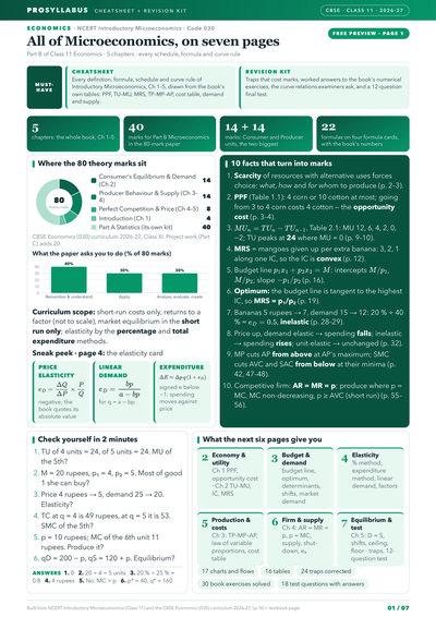
 2
2- Economics
 7
7- Mathematics
- Physics
- + 3 more
- Physics
- Chemistry
- + 3 more
 7
7- Accountancy
- Business Studies
- + 3 more
- Accountancy
 2
2- हिंदी
 2
2- हिंदी
 2
2- Chemistry
 2
2- Political Science
 2
2- اردو
- Urdu Elective
 2
2- हिंदुस्तानी संगीत
 2
2- Home Science
 2
2- Hornbill
- Snapshots
 3
3- Geography
 2
2- Sociology
- Physics
- Space weighted by unit marks
- Charts from the book's own data
- Traps corrected
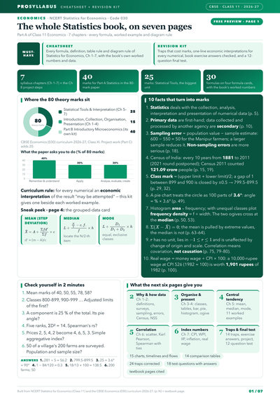
- Space weighted by unit marks
- Charts from the book's own data
- Traps corrected
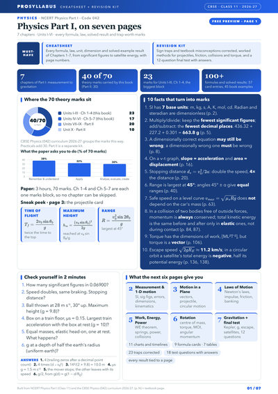
- Space weighted by unit marks
- Charts from the book's own data
- Traps corrected
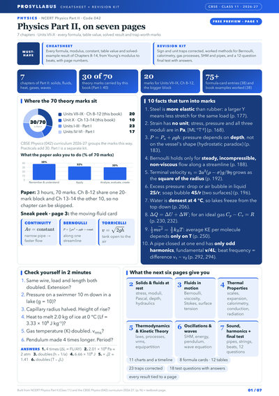
- Space weighted by unit marks
- Charts from the book's own data
- Traps corrected
- Space weighted by unit marks
- Charts from the book's own data
- Traps corrected
- Space weighted by unit marks
- Charts from the book's own data
- Traps corrected
- Space weighted by unit marks
- Charts from the book's own data
- Traps corrected
- Space weighted by unit marks
- Charts from the book's own data
- Traps corrected
- Space weighted by unit marks
- Charts from the book's own data
- Traps corrected
- Space weighted by unit marks
- Charts from the book's own data
- Traps corrected
- Space weighted by unit marks
- Charts from the book's own data
- Traps corrected
- Space weighted by unit marks
- Charts from the book's own data
- Traps corrected
- Space weighted by unit marks
- Charts from the book's own data
- Traps corrected
- Space weighted by unit marks
- Charts from the book's own data
- Traps corrected
- Space weighted by unit marks
- Charts from the book's own data
- Traps corrected
- Space weighted by unit marks
- Charts from the book's own data
- Traps corrected
- Space weighted by unit marks
- Charts from the book's own data
- Traps corrected
Chapter summary
Key ideas & terms
- Tabular presentation
- Arranging data in rows and columns, with a table number, title, captions, stubs, body, unit, source and notes.
- Bar diagram
- A geometric diagram of equispaced, equiwidth rectangular bars whose height shows the magnitude; simple, multiple or component.
- Pie diagram
- A circle divided into sectors in proportion to the components, after converting values into percentages (each percent = 3.6 degrees).
- Histogram
- A frequency diagram of adjoining rectangles whose area is proportional to class frequency, drawn for continuous data.
- Frequency polygon
- A diagram made by joining the mid-points of the tops of the rectangles of a histogram.
- Ogive
- A cumulative frequency curve of the "less than" or "more than" type; the two curves cross at the median.
Extra questions & answers
Name the three forms of presentation of data.
Data can be presented in textual (descriptive) form, in tabular form, or in diagrammatic form.
What are the main parts of a good statistical table?
A table number, title, captions (column headings), stubs (row headings), the body of the table, the unit of measurement, the source, and explanatory notes.
Name the three kinds of bar diagrams.
Simple bar diagram, multiple bar diagram and component (sub-divided) bar diagram.
How is the angle of each sector of a pie diagram calculated?
Each component is first expressed as a percentage of the total, and that percentage is multiplied by 3.6 degrees, since the whole circle of 360 degrees represents 100 per cent.
What is a histogram and for which data is it drawn?
A histogram is a set of adjoining rectangles whose area is proportional to class frequency, drawn only for continuous (grouped) data and used to read the mode graphically.
Distinguish between a histogram and a bar diagram.
In a histogram the rectangles touch with no gap and their width matters, whereas in a bar diagram bars are separated by spaces and only their height carries meaning.
What is frequency density and when is it used?
Frequency density is class frequency divided by the width of the class interval; it is used to draw a histogram correctly when class intervals are unequal.
What is a frequency polygon?
A diagram formed by joining the mid-points of the tops of the rectangles of a histogram; the area under it equals the total frequency.
What is an ogive and what does it give?
An ogive is a cumulative frequency curve, drawn as "less than" or "more than"; the point where the two ogives intersect gives the median of the distribution.
What does an arithmetic line graph show?
A time-series graph plots a variable against time to reveal trends and periodicity, as in the graph of India's exports and imports over the years.